Choosing a beam angle for wall art is not simply a technical decision. It controls brightness, texture, shadow, glare, and visual comfort. A narrow 10–20-degree beam can create a dramatic spotlight on a small painting. However, it may produce harsh edges or bright reflections on glass. A wider 30–40-degree beam usually creates softer coverage for larger artwork.
So, Which beam angle is best for highlighting wall art? The honest answer depends on artwork size, mounting distance, surface texture, and room brightness. The Illuminating Engineering Society’s Lighting Handbook stresses the importance of controlled distribution, visual comfort, and glare management. CIE 157:2004 also recommends careful exposure control, including approximately 50 lux for highly light-sensitive materials. Beam angle alone cannot protect artwork.
James Turrell, a leading light artist, famously said, “Light is not so much something that reveals, as it is itself the revelation.” That idea matters here. The fixture should reveal the artwork without becoming the main attraction. For a 60-centimeter canvas mounted 1.5 meters away, a 24-degree beam may create a focused pool of light. A 36-degree beam can look more natural on a wider frame.
There is no universal winner. Sometimes, the “perfect” angle still looks wrong after installation. Test the fixture at night, inspect glass reflections, and adjust its tilt by a few degrees. The final choice should balance precision, atmosphere, and preservation.
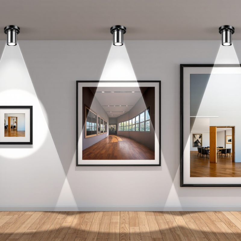
Understanding beam angles helps you control how a wall artwork appears. A narrow beam, usually 10–25 degrees, creates a concentrated pool of light. It suits small paintings or detailed sculptures. A wider beam, around 36–60 degrees, spreads light across larger artwork. It can also soften harsh contrasts between the artwork and the wall.
Measure the artwork first. Then measure the distance from the light to its surface. A simple estimate uses this formula: beam diameter equals distance multiplied by twice the tangent of half the beam angle. In practice, wall texture, frame depth, and fixture position change the result. I once selected a narrow beam for a medium-sized canvas, and the edges disappeared into shadow. My calculation was correct, but the room was not.
Test before drilling. Place a temporary light at the intended height and observe the artwork from normal viewing positions. Glare changes everything. Glossy paint may need a wider beam or a slightly offset angle. Textured surfaces often benefit from a controlled narrow beam, which reveals raised details through gentle shadows. For a 60-centimeter artwork mounted 1.5 meters away, a beam near 24 degrees may cover the center, while 36 degrees offers safer edge coverage. There is no perfect angle. Personal judgment still matters.
Choosing a beam angle starts with the artwork’s width, not the fixture’s appearance. Measure the painting, then measure the light’s distance from its surface. The basic relationship is simple: spot diameter equals twice the distance multiplied by the tangent of half the beam angle. At 1.8 metres, a 24-degree beam creates roughly a 0.77-metre spot. That suits medium-sized artwork more closely than a 36-degree beam, which spreads wider and may wash the surrounding wall.
Mounting height changes the effective distance. A high ceiling can make a narrow beam look dramatic but uneven. Aim toward the artwork’s upper third, while keeping the light source away from direct eye level. The Illuminating Engineering Society’s museum guidance commonly places sensitive works near 50 lux, while less sensitive materials may tolerate up to 200 lux. CIE 157:2004 also stresses that damage depends on both illuminance and exposure time. A narrower beam may increase brightness, so dimming remains essential. The formula helps, but real walls are rarely perfect.
Tips: For artwork under 60 centimetres wide, test a 15–24-degree beam. Medium pieces often suit 24–36 degrees. Keep the beam slightly wider than the artwork, about 10% beyond each edge. Check the wall at night. Reflections, frames, and textured paint can change the result. I still find mock-ups more reliable than calculations alone. A paper template can reveal overspill before installation.
Recommended beam angles are calculated from the artwork width and the distance between the light source and the wall using the beam footprint formula: angle = 2 × arctan(width ÷ 2 × distance).
Narrow artworks or longer mounting distances require narrower beams, while larger artworks or shorter distances require wider beams. For comfortable viewing, aim the light toward the artwork’s visual center and position the fixture approximately 30° from the wall to help reduce glare and uneven reflections.
How to Choose the Best Beam Angle for Wall Art?
Beam angle should follow the artwork’s visual scale, not the fitting’s appearance. For a small, high-contrast print, a 10°–20° beam can isolate the frame and create controlled drama. Texture benefits from shadow. At 1.5 metres, a 30° beam covers roughly 0.8 metres, making it suitable for medium paintings. Larger canvases usually need 40°–60° coverage, or two overlapping beams, to reduce dark corners. A practical test helps: place a temporary light at the planned distance and check the frame edges from several viewing positions.
Different art styles need different visual treatment. Glossy photography and varnished oil paintings often require a wider, softer beam, because narrow beams can produce harsh reflections. Sculptural or heavily textured work can accept a tighter beam and stronger contrast. For a salon-style layout, aim each beam toward the artwork’s upper third, then adjust overlap between frames. Avoid lighting every piece equally; hierarchy gives the wall rhythm. Still, this approach is not perfect. Pale artwork may need more light than expected, while dark work can lose detail under excessive contrast.
The CIE 157:2004 technical report uses 50 lux for highly light-sensitive materials and 200 lux for less-sensitive works. Measure illumination, not brightness by eye. IES TM-30-20 also recommends checking colour fidelity and gamut, rather than relying on colour-rendering index alone. The U.S. Department of Energy reports that LEDs use at least 75% less energy than incandescent sources, supporting efficient, adjustable installations.
| Art Style or Layout | Typical Artwork Size | Recommended Beam Angle | Suggested Fixture Distance | Approximate Light-Coverage Diameter | Recommended Lighting Approach | Key Considerations |
|---|---|---|---|---|---|---|
| Small framed artwork | Up to 60 × 60 cm | 10°–18° | 1.5–2.0 m from the artwork | Approximately 0.26–0.64 m at 1.5–2.0 m | Focused accent lighting | A narrow beam creates a concentrated pool of light and helps preserve contrast around a single small piece. |
| Portrait-format painting | 60–100 cm wide; 90–150 cm high | 18°–24° | 1.8–2.5 m from the artwork | Approximately 0.57–1.06 m at 1.8–2.5 m | Vertical wall washing with controlled edges | Aim toward the center of the artwork and check that the beam covers the full height without spilling excessively onto adjacent walls. |
| Landscape-format painting | 90–180 cm wide; 50–100 cm high | 24°–36° | 2.0–2.5 m from the artwork | Approximately 0.86–1.63 m at 2.0–2.5 m | Broad accent coverage | A medium beam usually balances horizontal coverage with visual focus, especially when the painting has a strong central subject. |
| Large statement artwork | Over 180 cm wide or high | 36°–60° | 2.5–4.0 m from the artwork | Approximately 1.63–4.62 m at 2.5–4.0 m | Wide, even illumination | Use a wider beam or several overlapping fixtures to reduce bright spots and provide more consistent coverage across the surface. |
| Triptych or three-panel artwork | Three panels, each 40–80 cm wide | 24°–36° per fixture | 2.0–3.0 m from the wall | Approximately 0.86–1.95 m per beam at 2.0–3.0 m | One controlled beam per panel or overlapping beams | Separate aiming provides better control than one very wide beam and helps maintain visual balance between panel gaps. |
| Gallery wall with mixed frames | Several pieces across 1.5–3.0 m of wall | 24°–36° | 2.0–3.0 m from the wall | Approximately 0.86–1.95 m per beam at 2.0–3.0 m | Layered and overlapping accent lighting | Use multiple medium beams aimed at visual groupings rather than lighting every frame with an excessively wide beam. |
| Textured or sculptural wall art | 40–150 cm in diameter or width | 15°–24° | 1.5–2.5 m from the artwork | Approximately 0.40–1.06 m at 1.5–2.5 m | Directional grazing and shadow emphasis | A narrower beam can emphasize relief and texture, but the light angle should be tested to avoid harsh shadows or distracting glare. |
| Minimalist monochrome art | 60–150 cm wide or high | 18°–24° | 1.8–2.5 m from the artwork | Approximately 0.57–1.06 m at 1.8–2.5 m | Precise, low-spill accent lighting | Controlled beams help preserve the clean composition and prevent the surrounding wall from competing with the artwork. |
| Color-rich contemporary art | 80–200 cm wide or high | 24°–36° | 2.0–3.0 m from the artwork | Approximately 0.86–1.95 m at 2.0–3.0 m | Even, moderate-width illumination | A medium beam can reveal color transitions while limiting excessive spill that may reduce the visual impact of saturated tones. |
| Artwork in a narrow corridor | 30–100 cm wide; 50–150 cm high | 15°–24° | 1.5–2.5 m from the artwork | Approximately 0.40–1.06 m at 1.5–2.5 m | Compact accent lighting | Narrow-to-medium beams reduce light spill into circulation paths and help avoid glare for people viewing the work at close range. |
| High-ceiling feature wall | Artwork positioned more than 2.5 m above floor level | 24°–36° | 2.5–4.0 m from the artwork | Approximately 1.06–2.60 m at 2.5–4.0 m | Long-distance accent lighting | Allow for the increased beam spread over distance and aim carefully to keep the center of the beam on the artwork. |
Coverage estimates use the geometric relationship: beam diameter ≈ 2 × lighting distance × tan(beam angle ÷ 2). Actual results vary with fixture optics, aiming angle, mounting height, surface reflectance, and the desired level of edge softness.
How to Choose the Best Beam Angle for Wall Art?
When I test wall art lighting, I adjust brightness before changing the beam angle. A narrow beam can highlight texture, but it may create harsh shadows around frames. A wider beam spreads light gently across larger artwork. Start with moderate brightness and observe the image from several viewing positions. The surface should look clear, not glossy or washed out. I often begin with a medium beam, then move the fixture gradually. This practical method reduces guesswork. Still, every wall finish reacts differently.
Color temperature changes the artwork’s emotional character. Warm light can enrich wooden frames and earthy colors. Neutral light usually preserves whites and skin tones more accurately. Cooler light may sharpen blue artwork, but it can make warm colors appear dull. Never judge color under one viewing condition. Check the piece during daytime and evening hours. I once selected a cooler setting that looked precise in the showroom, yet felt cold at home. That mistake reminded me to trust the room, not only technical specifications.
Tips: Keep the light slightly above eye level to reduce glare. Test brightness at night, when reflections become more visible. Use a temporary lamp position before fixing hardware permanently. If shadows look uneven, widen the beam or shift the fixture sideways. Leave a small adjustment range, because perfect alignment is rarely achieved on the first attempt. Measure twice. Observe longer.
How to Choose the Best Beam Angle for Wall Art?
Testing and Fine-Tuning the Final Lighting Position
I usually begin with a moderate beam angle and aim the light about 30 degrees from the artwork’s surface. This position helps reveal texture while reducing direct glare on glass. I mark the first location with removable tape. Then, I test the light after sunset, when daylight no longer affects my judgment.
Stand back. View the artwork from the room’s main seating area. A narrow beam can create a bright hotspot, especially on glossy paint or varnished frames. A wider beam may soften the image too much. I check the frame edges, nearby wall, and shadows beneath the artwork. A simple light meter can help compare brightness across the surface. However, measurements do not replace careful observation.
I fine-tune the fixture in small movements, usually two or three centimeters at a time. Tilting it slightly can reduce reflections without making the artwork look flat. Wall color and surface texture also change the result. A pale wall may bounce extra light, while a rough wall can scatter it unevenly. My first position is rarely perfect. I once focused too closely on the painting and ignored glare from the lower frame. Leaving the room, returning later, and checking from different heights often reveals mistakes. The final position should make the artwork feel clear, balanced, and naturally connected to the room.
Try a 10–25-degree beam. It creates a focused pool of light. Test 15–24 degrees for artwork under 60 centimetres wide.
A 36–60-degree beam spreads light across a wider surface. It can reduce harsh contrast around large artwork. Wider is not always better.
Use this formula: spot diameter equals distance multiplied by twice the tangent of half the beam angle. At 1.8 metres, a 24-degree beam creates roughly a 0.77-metre spot.
Aim slightly wider than the artwork. About 10% beyond each edge usually provides safer coverage. Exact calculations can still fail on real walls.
A high ceiling increases the effective distance. Narrow beams may then look dramatic but uneven. Aim toward the artwork’s upper third, away from direct eye level.
Glossy paint can create glare. Try a wider beam or shift the light slightly off-center. View the artwork from normal standing positions.
Yes, controlled light can reveal raised details through gentle shadows. Keep checking for dark patches. Texture sometimes behaves unpredictably.
Sensitive materials may need about 50 lux. Less sensitive materials may tolerate up to 200 lux. Exposure time also matters, so dimming remains important.
Calculate it, but test before drilling. Use a temporary light or paper template. Check the wall at night. My calculations have been right, while the room was wrong.
Choosing the right beam angle is essential for presenting wall art with balanced brightness, clear detail, and minimal glare. A narrow beam angle creates focused illumination for small pieces or specific features, while a wider angle provides softer, more even coverage for large artwork or grouped layouts. The ideal choice depends on the artwork’s size, its distance from the light source, and the mounting height. Which beam angle is best for highlighting wall art? In most cases, it is the angle that covers the artwork evenly without spilling excessive light onto nearby walls.
Different art styles may benefit from different lighting approaches. Adjust brightness to preserve detail without overwhelming colors, and use shadows carefully to add depth while avoiding distracting contrasts. Color temperature should complement the artwork’s tones and the surrounding room. Before finalizing the installation, test several positions and beam angles, then fine-tune the light’s height, direction, intensity, and color until the artwork appears natural, visually balanced, and inviting.

Ledic Lighting